Even if you’re on lots of online travel agent sites and specialised activity selling sites, your own website is the most important marketing tool you have. Obviously, a direct booking from your own site — where you don’t pay any commission to a third party — is first prize for your marketing efforts.
With the help of some experienced colleagues in the industry, here are some tips on what visitors look for on your activity website.
Lots of good, big photos
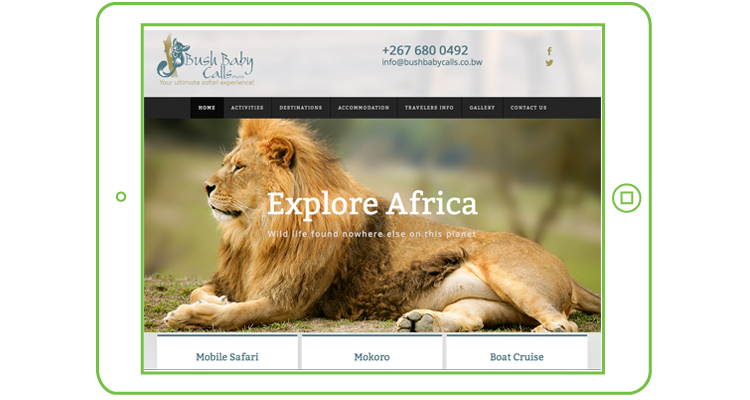
People do a lot of research online before they book. They will generally compare at least 4 to 5 websites, and photos create the first impression for them. Since research is about learning facts, bear in mind that a large amount of people are visual learners. They need pictures to tell the story.
Guests want to see what your activities are all about. There should be decent-sized visuals on all the pages, especially the home page. Animated slide shows are good – but only if they load fast. Good photos are ones that capture the feeling of your activities, that are real and not just copied from Google.
Suzie Allderman, (website designer), recommends that you stay away from too many stock images, such as pictures of Table Mountain, and rather focus on unique images of what you offer.
Importantly, your photos should provide a true reflection of what a customers can expect when they book. Making everything look “too pretty” and thereby disappointing the guest on arrival, can backfire badly. Another tip is to include people in some of the photos, so that your guests have a “wish I were there” feeling. Good examples are of people looking at vistas & enjoying your activities.
If you don’t currently have good photos, pay an experienced photographer to take some. It will be the best investment you can make for your online image.
Show off your Book Now button.
Since your marketing efforts are aimed at getting customers to your website, make sure they can book immediately. As an ActivityBridge client you should have this all-important point covered, by linking your website to the realtime booking engine.
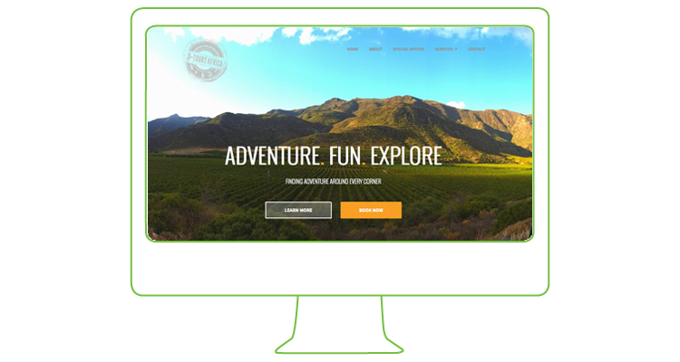
However, we’ve been surprised at how many of our customers hide the booking button. It’s either really tiny, at the very bottom of the page (out of sight), or on one page only. You’re losing booking opportunities if you do this.
Take a look at your website through the eyes of someone who has never been on it before. Is the “Check Availability and Book Online” link prominent? Easy to find? Above the fold? (Think of a newspaper — You see what’s on the front, top-half of the page. Don’t make visitors scroll down to find the booking button).
People generally look at information online in an F-shape. The image below shows the dominant online reading pattern of users. It was first discovered by usability expert Jacob Nielsen in 2006. This means that you should add your availability widget or a book now button on the top left or top right of your pages. Include the button or link on all your pages.
Users also often scan from the top left to the bottom right of the page in a Z-shape. It is therefore useful to add a call to action booking button, link or widget on the bottom right of the page too – above the line (area where people need to start scrolling down).
As much as the booking button is what you would like your customers to click on, you should not forget of the traditional calls-to-action. Make all forms of communication channels clear and distinguishable. That is your email addresses, telephone numbers and/or enquiry forms.
Location, location, location
Strangely, this is often missing! You can’t guarantee through which search process customers find your site. They may actually not know which town you’re located in. Make sure to prominently display your address. It is very useful to mention the suburb, town and country in your text, as well as in the web page title. Search engines can pick up this content. It’s even more useful to add a page that describes your town or suburb and its attractions. But remember to add this information on the Home page as well.
A printable map with your address, contact number and directions from the airport is useful. Show and explain your location relative to attractions.
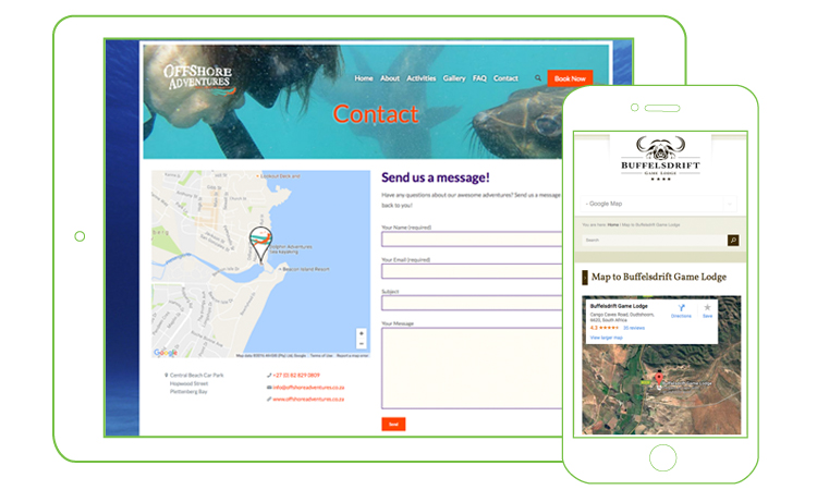
Most clients now use Google maps on their phones to get driving directions. Make sure that your business shows up correctly. Find out how to add your business on Google maps or get someone to do this for you. This also helps your search engine ranking.
Content is King
By content, we mean the writing on the pages, describing the beautiful photos on your site. Apart from the visuals, you also need text to explain what you offer. The big bonus of good text is that the search engines love it.
Get help with your writing — there are lots of freelance journalists. At least get your content checked for spelling and grammar. Sub-editing (checking and re-writing by a professional) should cost around a few hundred Rands an hour.
Include concise, well-written descriptions of your activities in your own style, focusing especially on the various activities you offer and unique selling points.
Taking a fresh look at your site can pay off handsomely. We look forward to hearing (and seeing) your success stories.
Useful links:
Find out more about how to adjust your web layout and get more bookings in these articles:
- Understanding the F-Layout in Web Design
- Understanding the Z-Layout in Web Design, and
- 10 Usability Tips Based on Research Studies.